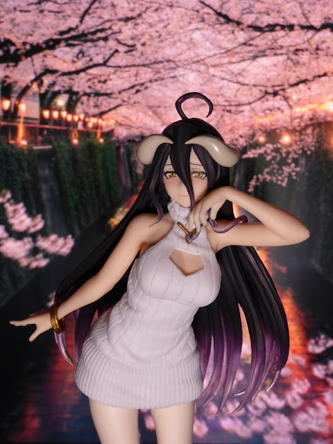
Hey there. I just received this awesome Albedo figure from Taito and I decided to test out more background photo pics with figures. Here's the latest one.
I think this one came out better than the other Albedo picture I took BUT... I don't like the disparity between the figure size and the background. It kind of makes Albedo look like a giant. I need to work on perspective and seeing how to make the figure correlate with the background. Nevertheless, I do think it's a nice picture but I know it could be better.
Also, the lighting is off. I wanted to go for a soft lighting to mimic the background but my light source and direction is all off. I need to find a way to better adjust the lighting for these types of pictures. If anything... I see progress but I still have a ways to go!
Any tips? Do any of you have any tips for a rookie photographer? I currently have 2 light cubes (which can change color) and a white light ring light to work with. I'm open to criticism so let's hear it in the comments on how I can improve!
So what do you all think of this picture? Like it, don't like it? Let's hear it in the comments! Share your thoughts with me. Thanks!


No comments:
Post a Comment
Thank you for your comment. Comments are reviewed within the hour I receive the request.